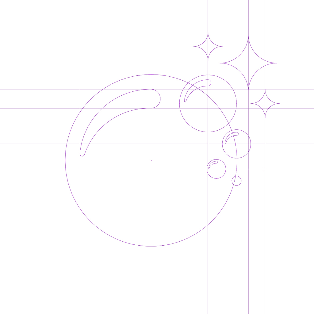
This project started without many parameters or direction. The startup PROCLEAN, a provider of commercial cleaning services, needed a well-defined brand image to stand out from the competition but did not really have any other requirement. Multiple options and shapes were considered. It was decided to go with the shape of a sparkling bubble.
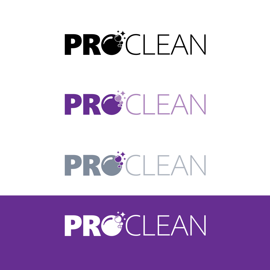
Once the shape was defined, the next step was to define the color scheme to reflect the quality of the services that the startup provides. Different alternatives were created for the varied possible uses of the logo: dark and light backgrounds, monochrome prints and multiple colors.
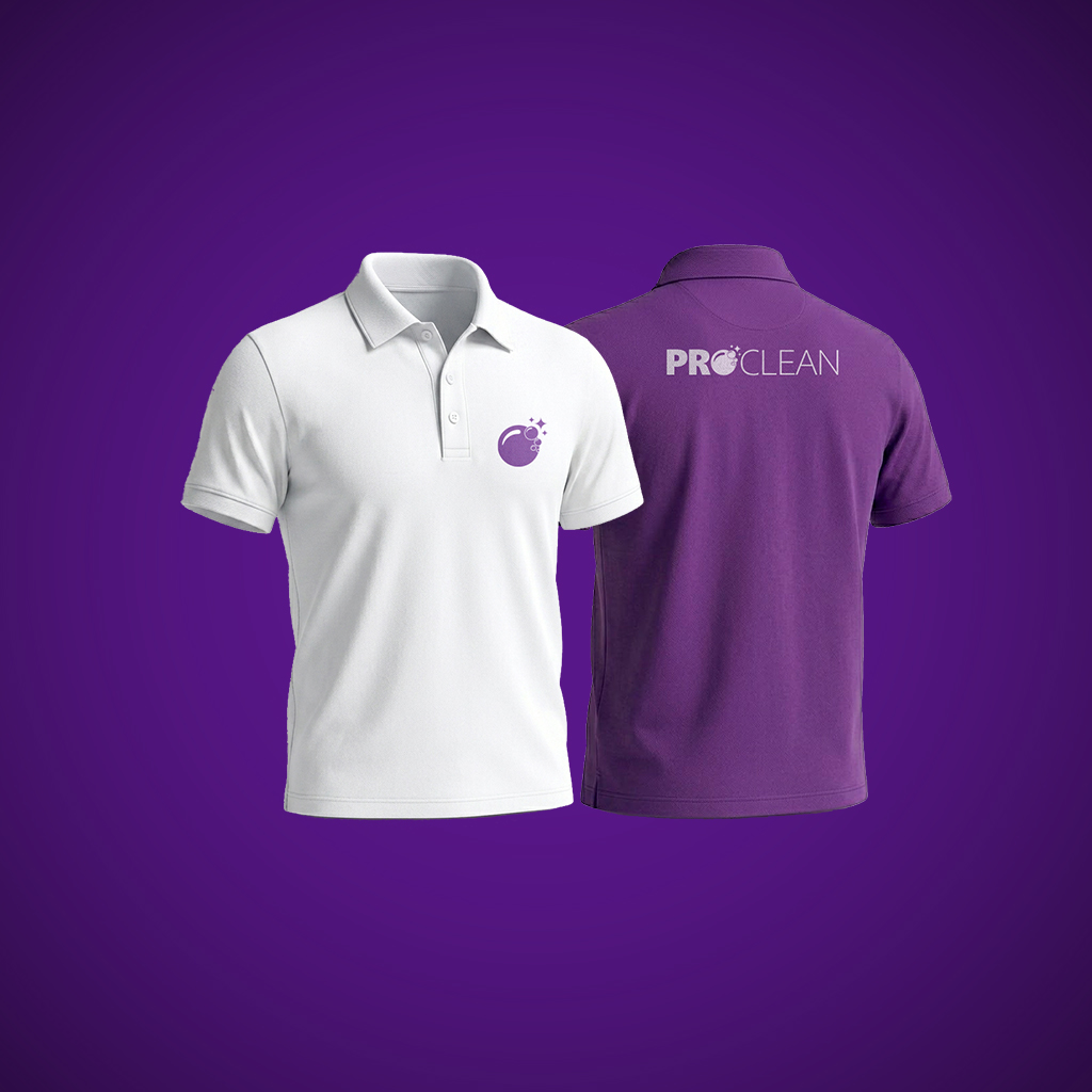
Facing customers on a regular basis, a neat-looking uniform that would align with the two items above was required, and this was also incorporated to the scope of this project.